Review as a team
Invite another perspective. Give feedback about a specific element and describe what you observed, rather than assigning a score.
A fictional companion for reviewing the details that shape a digital experience. Learn the workflow, try a preview and leave useful context.
This preview changes type size and surface color. It is a design demonstration, not an automated accessibility audit.
Preview: standard type, purple surface.
Leave space between your lines, make the next action clear and listen to the person trying to use your work.
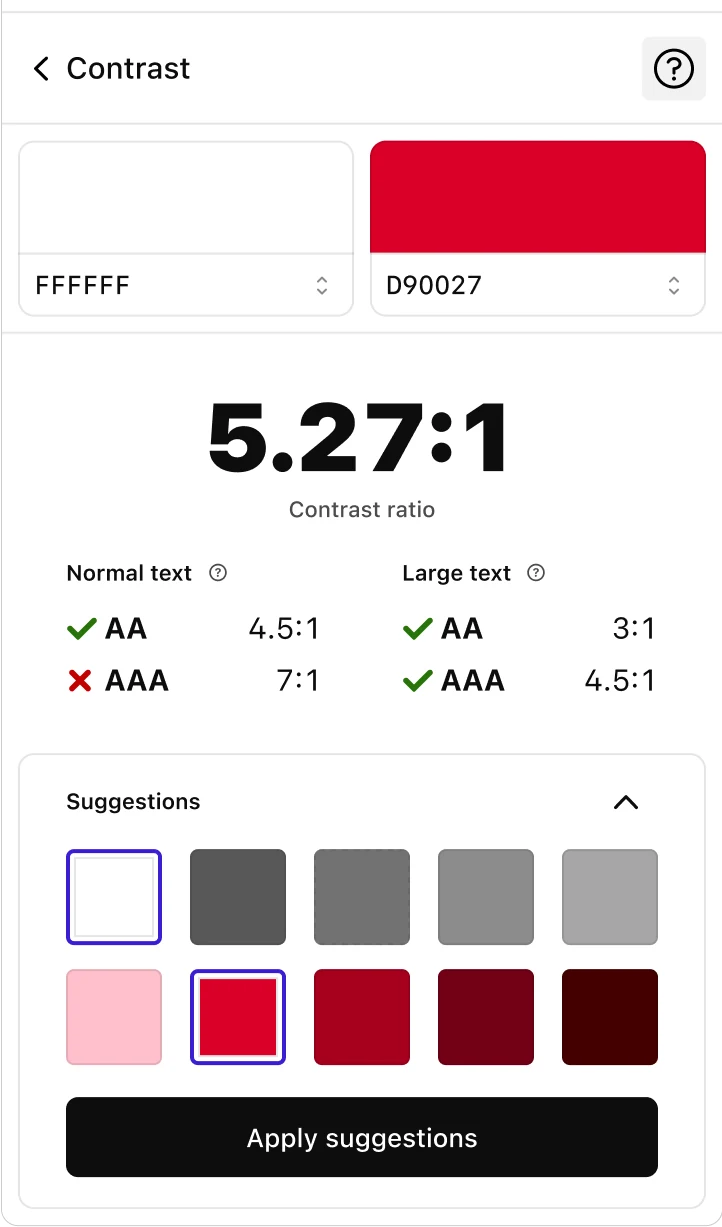
Use the illustrative color pair panel to start a conversation about legibility. The displayed ratio is sample data, not a live checker or a conformance guarantee.
Explore the tools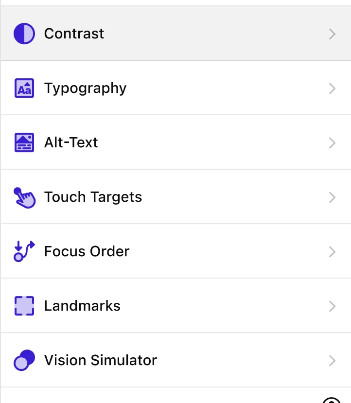
Type size, line spacing and clear hierarchy all contribute to a useful reading experience. Start with the preview above, then test your actual content with real people.
Explore the tools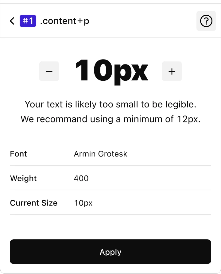

Sketch a sensible path through your interface. Think about where someone begins, how they move and what happens when a step needs more explanation.
Explore the tools
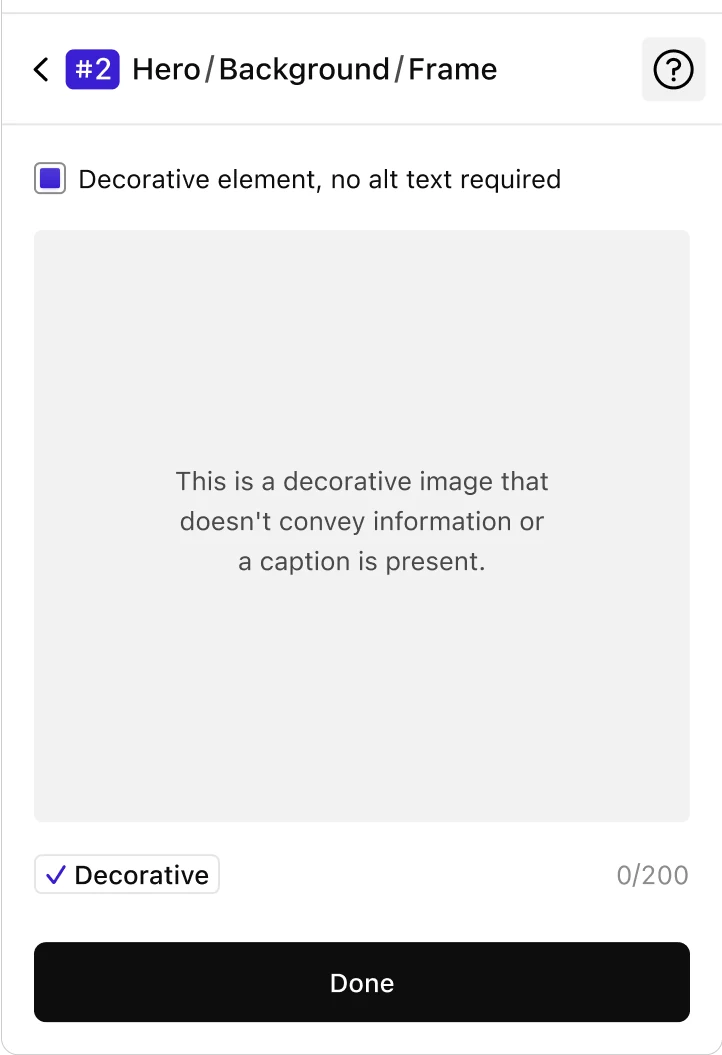
Image descriptions work best when they serve the purpose of the surrounding content. Our fictional note shows how a teammate could record that reasoning.
Explore the tools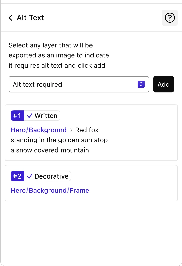
Invite another perspective. Give feedback about a specific element and describe what you observed, rather than assigning a score.
Keep a short record of the decision, its context and the person who will revisit it. The handoff should carry the story, not just the file.
Choose one detail to improve in the next review. Document what changed and keep learning from real use. This demo does not certify compliance.
Explore this fictional workspace, then make the template your own with real stories, tools and services.